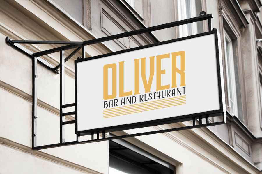
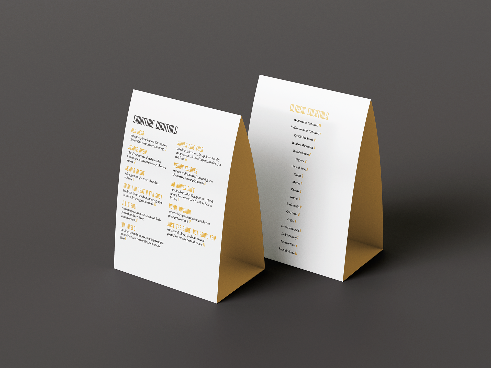
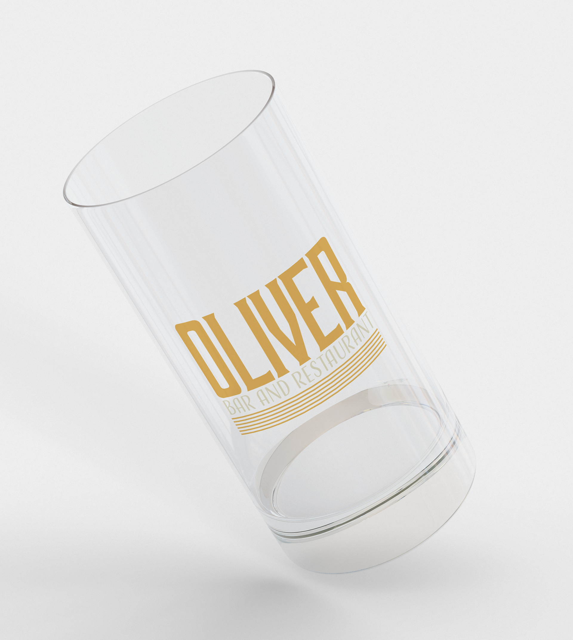
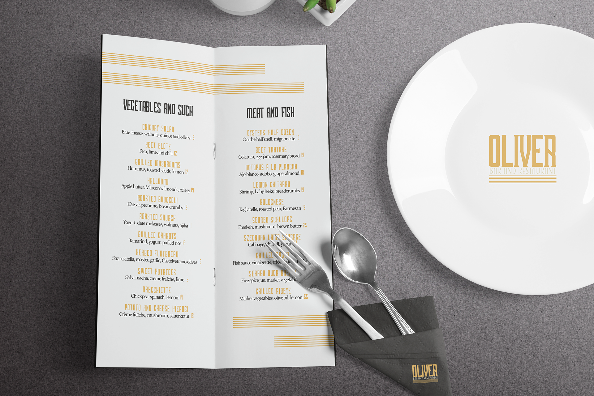
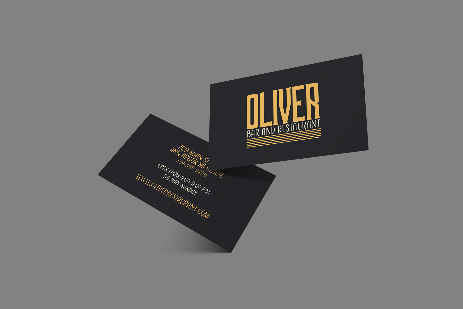
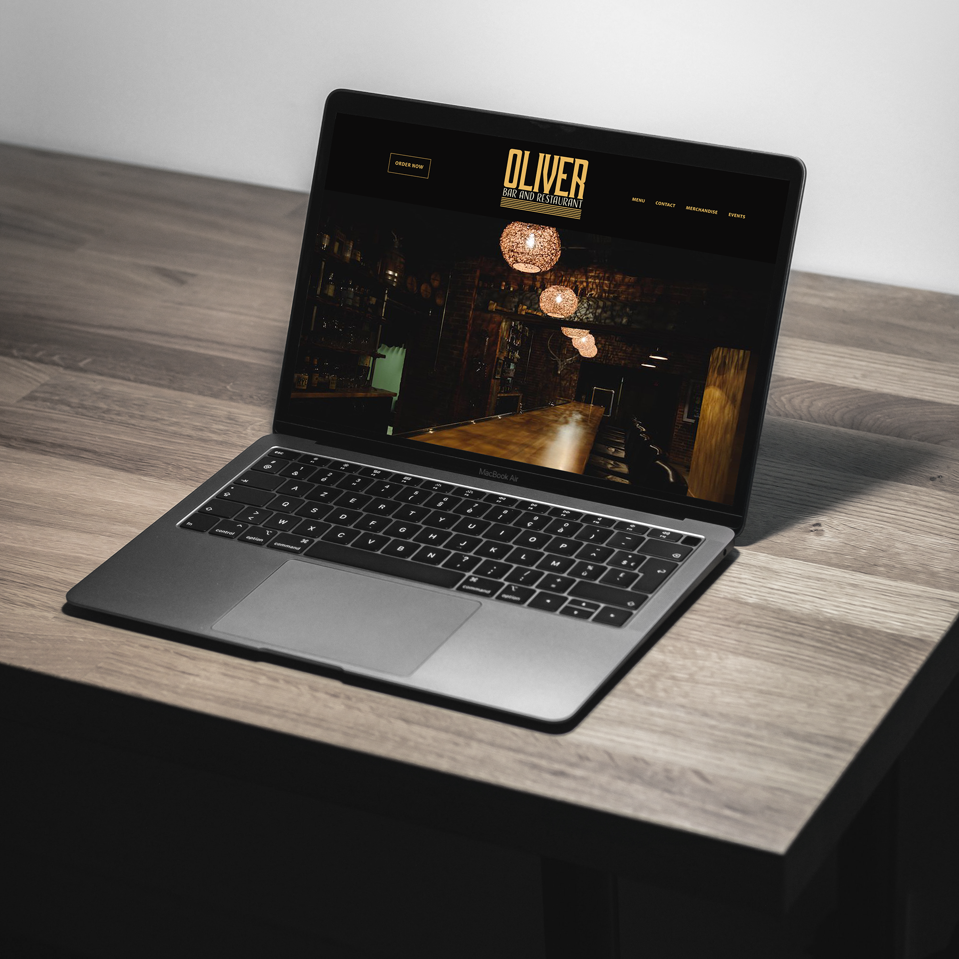
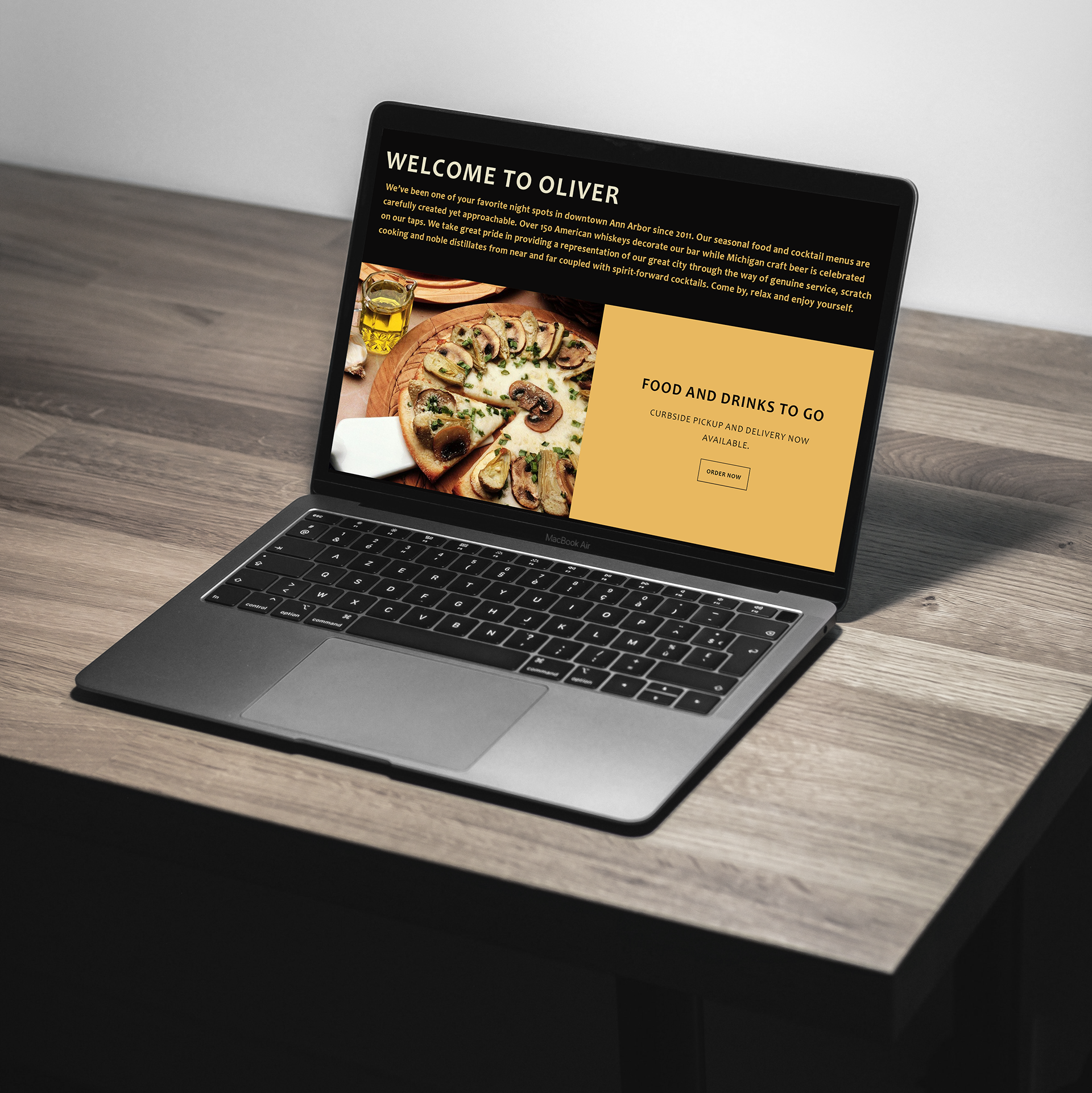
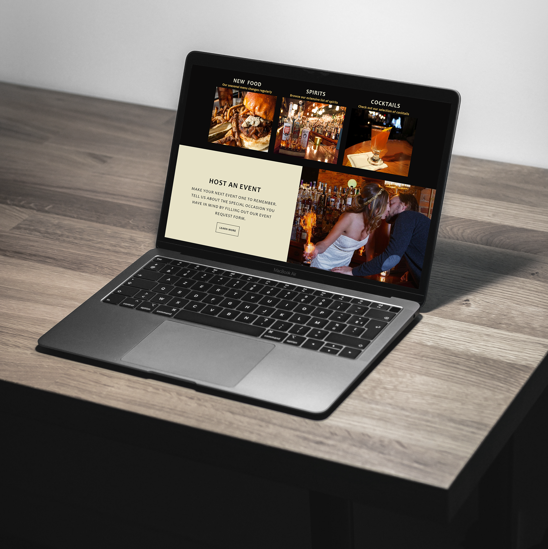
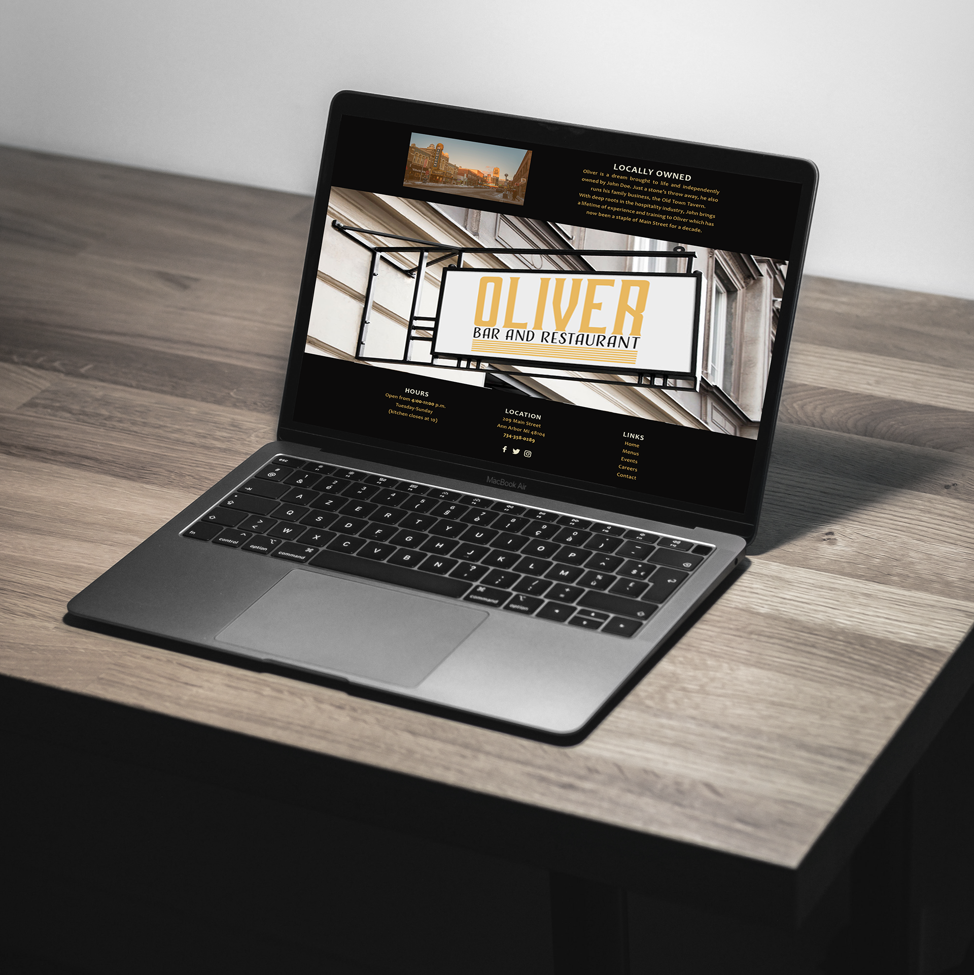
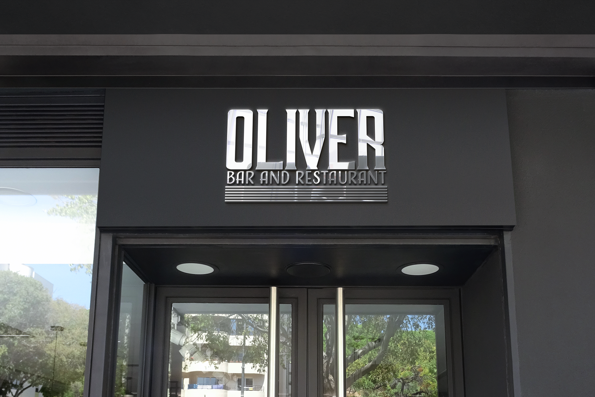
For this assignment I was put in a scenario where I was a designer who was hired to design a logotype and menu for a new bar/restaurant opening on main street in Ann Arbor named Oliver. The target audience for this restaurant was 25-40 year-old foodies who would come to the bar/restaurant with a date or small group of friends for specialty cocktails and a local, seasonal menu. The mood was warm, cozy, hip, and slightly upscale with a "speakeasy" vibe. Keeping that in mind, I chose to design an Art Deco theme for my restaurant as that was popular during the time period that speakeasys were active. For my typeface I chose simple, geometric fonts and a vibrant yellow and a soft black for my branding colors because those were all common characteristics found in many Art Deco patterns.